Big Data Exchange 2014
On 26 November 2104, I attended the Big Data Exchange held at Skills Matter, London. At the time, I was becoming more interested in using programming skills in more analytical / quantitative ways rather than the traditional software development I had been doing for the past 7.5 years. I recently finished a Coursera module in Data Science and my last textbook on the field, was John Foreman's (excellent) book, Data Smart.
I saw great talks at the conference from NASA's Chief Data Scientist, interesting Excel add-on tools from Felienne Hermans among others. The talks I thought were most interesting were the Statistical methods described by Abigail Lebrecht of uSwitch.com and Andrew Clegg's presentation on clearer, more honest ways to visualise data.
Automating answers to big data traffic questions - Abigail Lebrecht
Lebrecht's talk stemmed from the commercial Statistician's daily problem: making time for deeper investigations in to user data when there are daily / sporadic requests from management to explain why User Visits and (Browser to Buyer) Conversions drop at a given time.
Firstly, the point of showing Statistical Significance with data was made: drops should be seen not in absolute terms; they should take in to account the likelihood of Error / random fluctuation which might account for the change. uSwitch employ Change Point Detection to identify when metrics vary beyond expected tolerances.
Change point detection: tries to identify times when the probability distribution of a stochastic process or time series changes [Wikipedia]
Specifically, the uSwitch Analytics team use Bayesian Changepoint Detection which yields probabilities that a change point in a time-series is a systematic change rather than a random fluctuation: changes to the Series below a threshold would indicate just noise. The speaker said the threshold to indicate a statistically significant change was a probability > 0.4 as their team's rule of thumb. The speaker recommended this paper which explains the technique: Bayesian Online Changepoint Detection. BCD is implemented in the BCP library of R which returns a posterior.prob value; the likelihood of the change being significant.
This detection method is used to identify changes in visits / customer-conversion to specific products. If significant changes do occur, uSwitch analyse Twitter sentiment on keywords associated with the specific product to find correlation to the sales data. Lebrecht mentioned the use of Machine Learning techniques and then described Natural Language Processing processes to analyse Tweets. It was explained that a Stop Word List is needed – a list of words that should not be analysed for sentiment as they are the subject of the Tweet. Eg. In a Tweet “I think Matlab is an excellent language” the sentiment / occurrence-count of "Matlab" is not relevant. It does matter that Tweets about Matlab with the word "excellent" occur more or less frequently with time. The Stop Word List should also include words like "because", "where", "think" which come up frequently in a sentence but give no indication of sentiment.
Lebrecht then described building Heatmaps to visually show the change of language with time. The 100 most frequently used terms are listed against a date range. The matrix this forms is then coloured to show the frequency of each word’s use. A darker colour indicates greater use of the corresponding word. Analysts then try to use the matrix to get an idea of the phenomena at play when the change in sales data occurred.
Finally, the speaker discussed attributing a sale to advertising methods employed to bring about the sale: if a user came to abc.com four times before making a purchase, how do you weight the importance of each advert and weight allocation of advertising budget in the future? The environment that contributes to a sale can be complex – likened to the effectiveness of a player in a football team: a mid-field player may score few goals but may be an integral part of a team that creates many opportunities for others. The Shapley Value is a measure of this usefulness and can be assigned to football players or advertising providers. Lebrecht also stated the Beta Distribution is another good - more simple - model for attribution. The Beta Distribution weights significantly more importance to the first and last adverts, giving a small amount of credit to the adverts in the middle. Sales' attribution seems to be a hotter topic of current research. This paper was mentioned as influential in the field: Time-weighted attribution of revenue to multiple e-commerce marketing channels in the customer journey.
Lies, Damned Lies & Dataviz - Andrew Clegg
Clegg’s talk was about the use the connection between raw data and summarisation – how simplification of the data may not always express the same conclusion. Many different points were made including soft skill aspects to data representation: keeping visualisations simple.
I found Anscombe’s Quartet a very interesting to learn about – how these four sets of data differ greatly in raw terms and yet when summarised by mean, SD, linear regression, the sets are apparently identical. It should be clear that in only the top-left plot is the determined line of best fit drawn through the appropriate for the data.
[caption id="" align="alignnone" width="1280"] Anscombe's Quartet (source: Wikipedia)[/caption]
I also learned about the Zipfian distribution which fits many uses, including these examples:
Number of posts a user makes on Stackoverflow
- Number of Retweets a sample of Tweets will receive
- The frequency that a random set of words occur in a random sample of text
For data that fits this distribution, averages and values derived from them are inappropriate – the distribution is asymptotic as x ← 0 and will have a gigantic tail which will also skew averages.
Using this Python code snippet I made this sample distribution using the Zipfian function.
import numpy as np
from collections import Counter

alpha = 2
xs = np.random.zipf(alpha, 100000)
[(k, v) for k, v in Counter(xs).items()]
[iframe width="460" height="345" frameborder="0" seamless="seamless" scrolling="no" src="https://plot.ly/~noelevans/1.embed?width=460&height=345"]
Clegg’s talk then moved on to different types of charts. Many different examples were given to show that Pie Charts are very poor at clearly describing data and they get worse still when drawn in 3D (worst when separating the slices from the “Pie”).
I had never seen Violin Plots before which – for a technical user – can very clearly give the impression of distributions' change through a more complex data set. There are some good examples and comparison with Box Plots here.
[caption id="" align="alignnone" width="334"]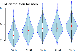 Example violin plot (source: School of Mathematics and Statistics, University of Glasgow)[/caption]
The speaker mentioned using ColorBrewer when selecting a colour palette for visualisations – particularly for colourblind viewers. He also talked about how colours can be used constructively to show changes (like in a Heatmap). However palettes can naturally be associated to different themes and charts should not make inferential connections inappropriately eg if graphing data about cancers, do not use colours where shading gets darker and darker if no one of the cancers is worse than the others. Clegg’s slides provide a number of tips outlining this further: Skills Matter presentation / very similar blog post from Clegg while at Pearson.
When responding to questions, Andrew was asked about preferred visualisation tools. He mentioned plot.ly which I’m a big fan of and also D3 which also came up in Robert Witoff’s NASA talk as a good, open source method to visualise data.